PLL Announces New Throwback Jerseys
After a phenomenal weekend in Baltimore, the Premier Lacrosse League has announced their (slowly becoming) annual throwback jerseys for this weekend’s trip to Denver. For those who want to say I didn’t blog anything about the local weekend, I was busy watching the games in person, including this Tom Schreiber OT game winner:
.@TomSchreiber26 SEALS THE DEAL IN OT ‼️
— Archers Lacrosse Club (@PLLArchers) August 5, 2023
Archers on top ? pic.twitter.com/jDiIVcb8r4
If you weren’t there to witness greatness in person, there’s always next year. On to bigger and better things. As many people know, and much to the chagrin of my fiance, I am a fiend for lacrosse apparel. So of course, after dropping a ton of money on Indigenous heritage apparel, the PLL drags me back in with some phenomenal throwback looks. Now, some are saying that it would’ve made a lot of sense to utilize throwback jerseys during the hall of fame induction weekend since it involves throwback players. I’m not saying it, but people are.
It wouldn’t make any sense to just show what the jerseys look like, right? The best way to do this is always through a completely objective ranking system. So without further ado, here is Sean’s Absolutely Objective but Totally Correct and Can’t be Argued With ranking of the PLL Throwback jerseys.
- Chrome
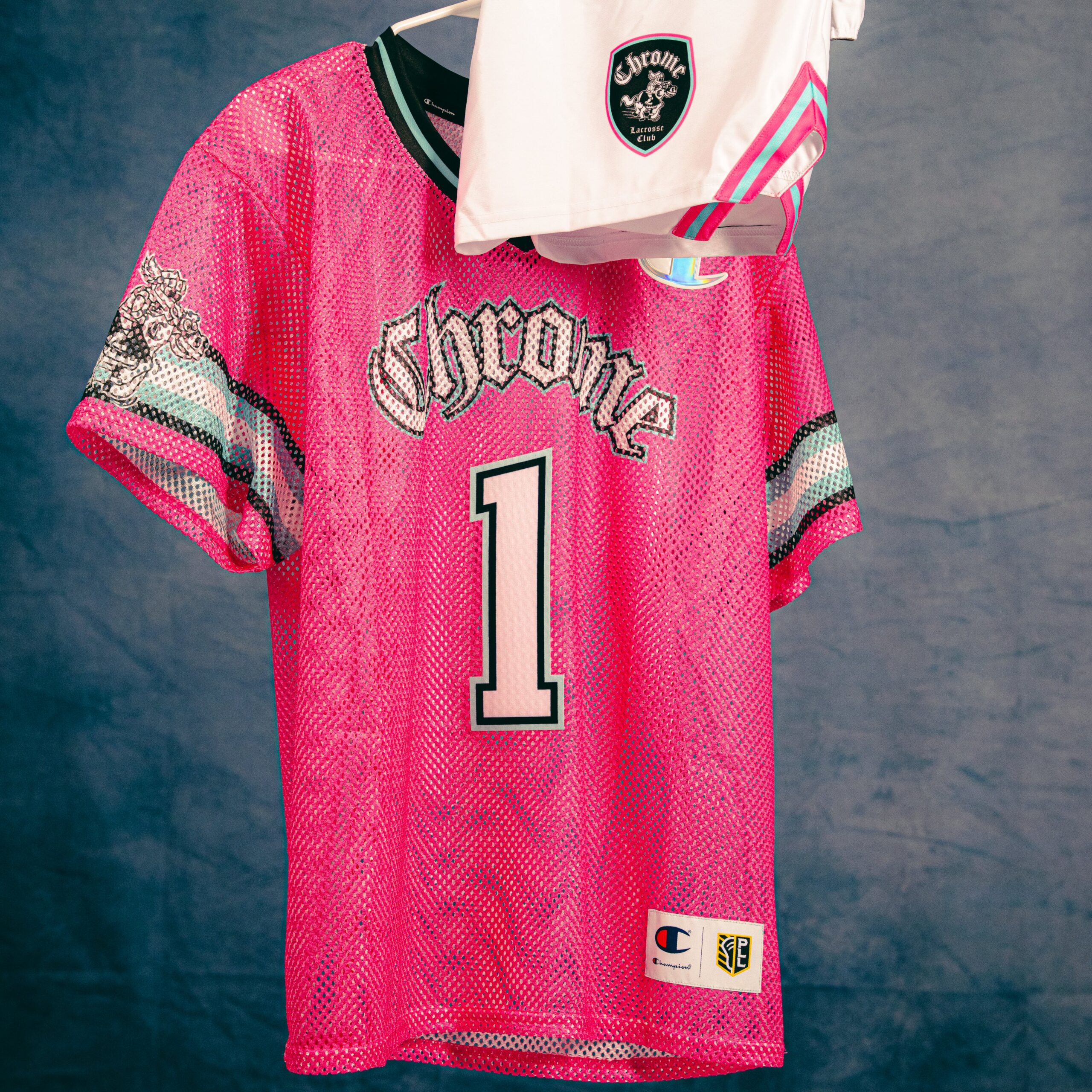
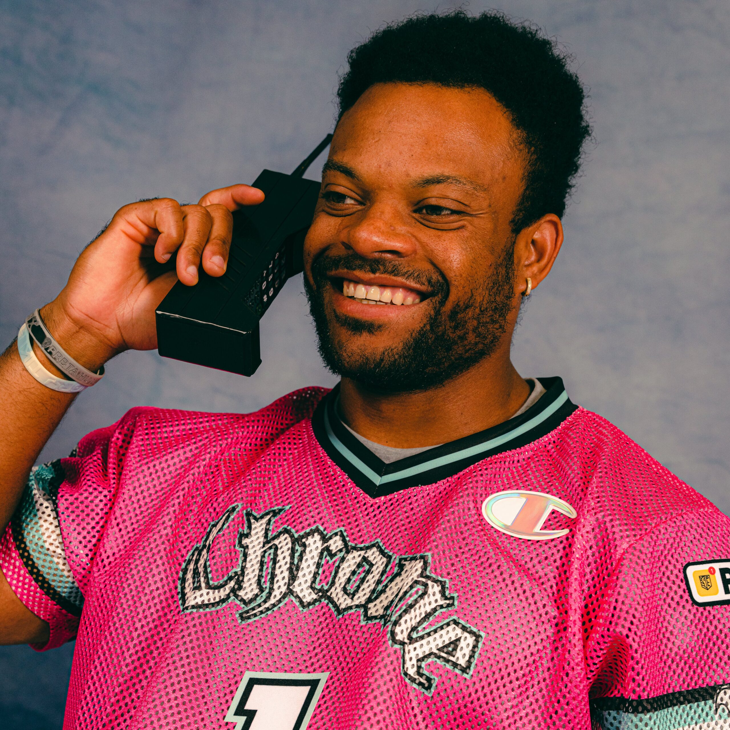
FINALLY! Chrome LC has made a primary pink jersey. Fans have been clamoring for this seemingly since the inception of the PLL. The consistency in font type is always key, especially with the club leaning into a medieval type of feel. The collar is a perfect execution of what throwback jerseys used to look like, and the arm bands with the cartoon horse is a chef’s kiss level design with a throwback style cartoon to boot. The Chrome haven’t won much on the field this year, but they’re winning with this uni. Final verdict: flawless victory.
2. Whipsnakes
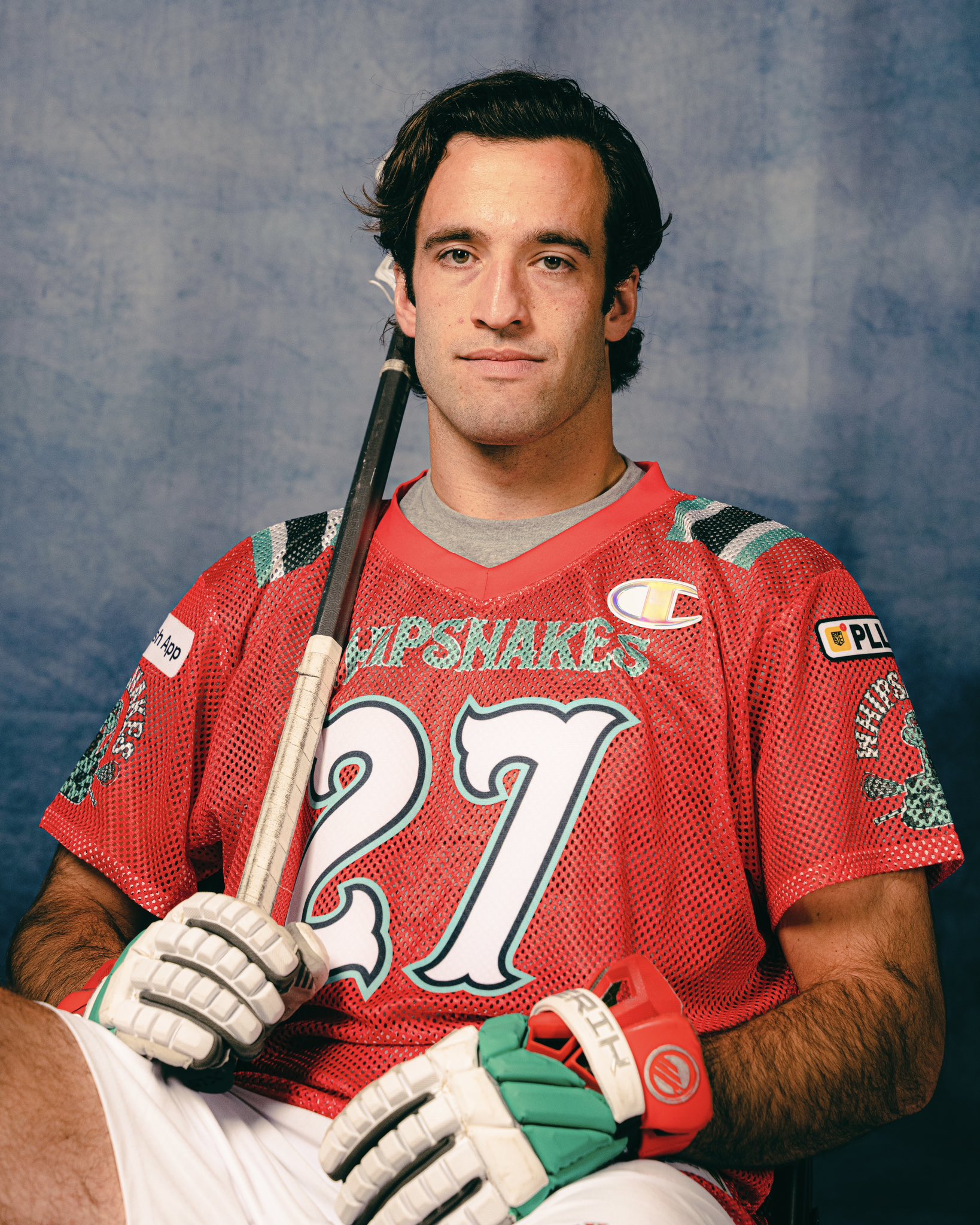
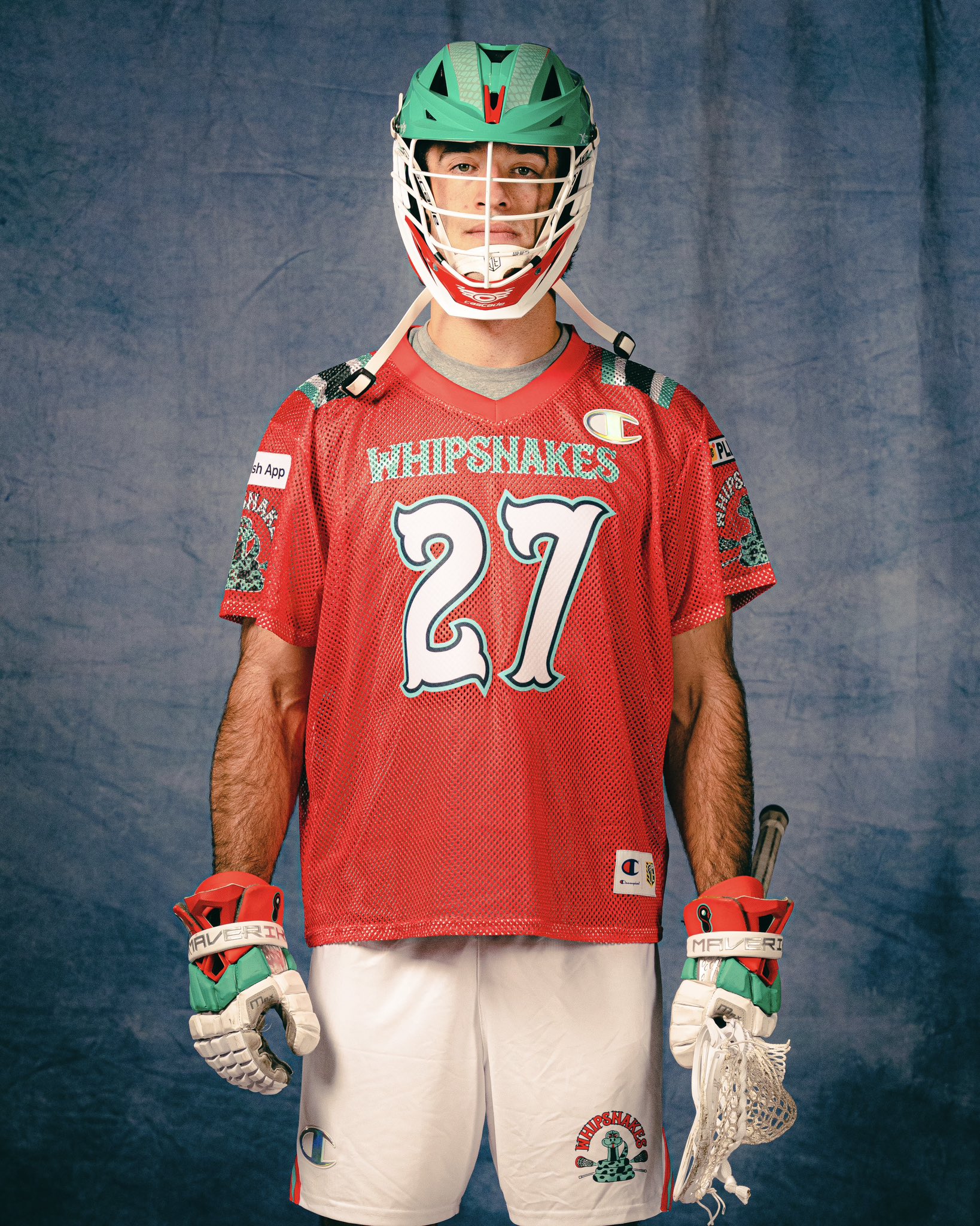
This was my number one option until I came across Chrome’s jerseys. I love the font choice for the lettering and numbers. Red primary, teal lettering and the white numbers with a teal outline absolutely POPS. Only knock I have is that I think I would enjoy the white with teal outline on the letter for the chest plate, but I can appreciate the consistency with the lettering on the sleeves. Final note, I cannot rave enough about the shoulder pad stripes with a block of black mesh put in the middle. The contrast of it is beautiful in my mind. Final verdict: absolutely crispy look.
3. Cannons
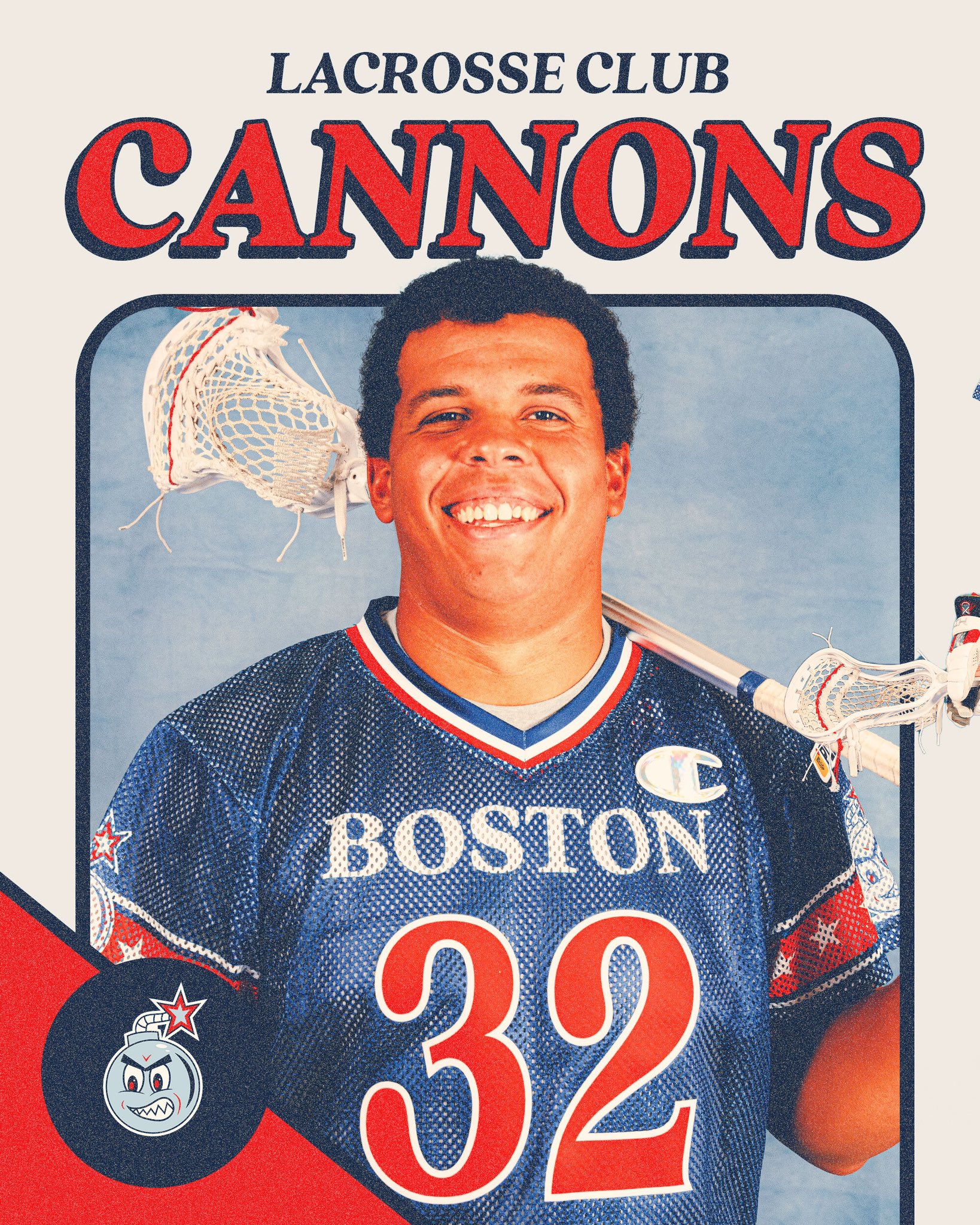
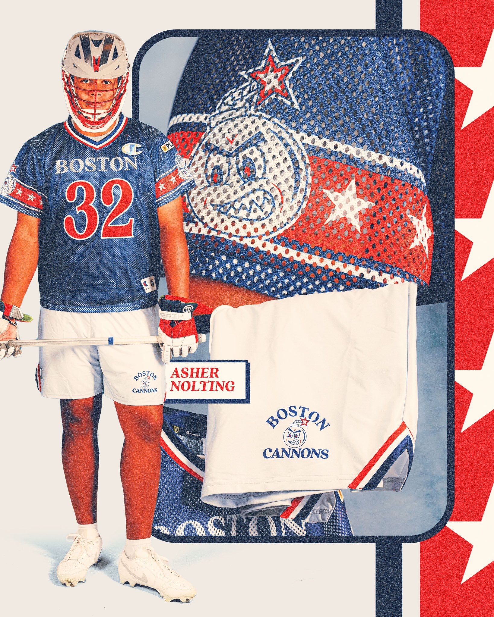
Another beauty of a uniform comes in the form of Cannons LC. While it hasn’t been confirmed yet, fans of the PLL have widely come to assume that the Cannons will be put in Boston, their home base when in the MLL, as a natural fit. Throwback jersey, throwback city, it’s a perfect match. The red arm band with the white stars would have been immaculate, but the cartoon bomb truly puts this over the top. This is a timeless type of look that the team should adopt as a permanent option. Final verdict: perfectly clean-cut.
4. Chaos
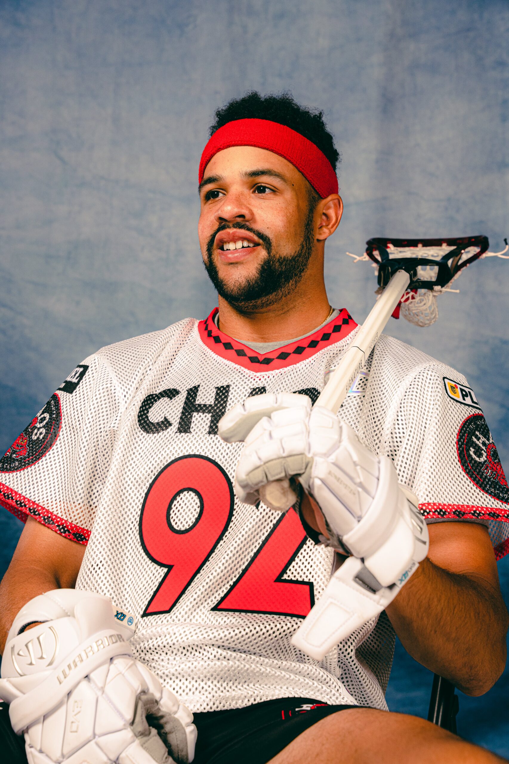
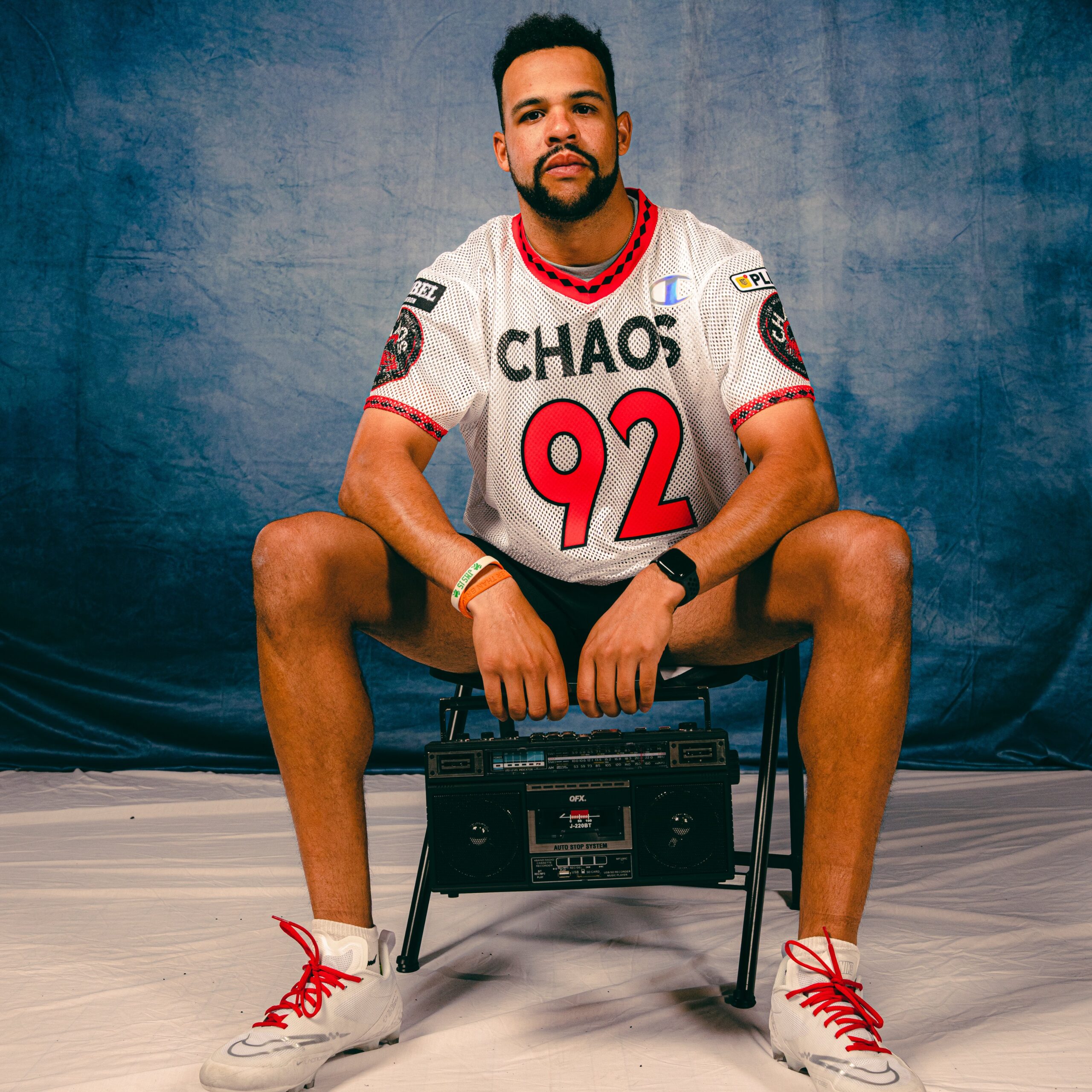
Those who are close to me know that I’m normally not a fan of white primary’s over another color. However, this look by Chaos is the textbook definition of what I would look for in a throwback jersey. Simple, but clean front. Huge numbers and letting, massive arm band logo. Diamond style collar and sleeve-ends. Plus, Dhane’s headband in the first photo really sets the look off. Final verdict: icy and clean.
5. Archers
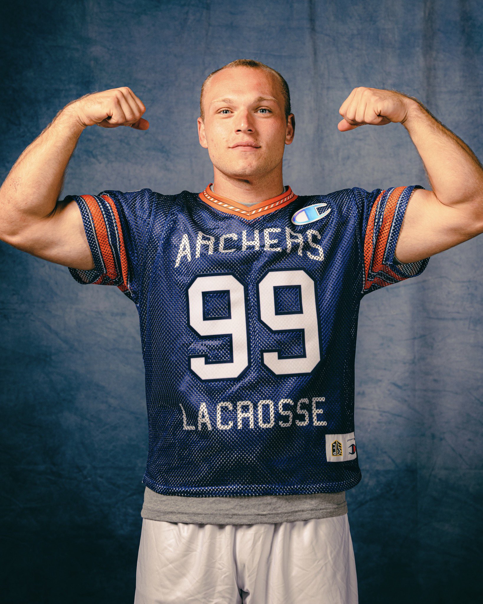
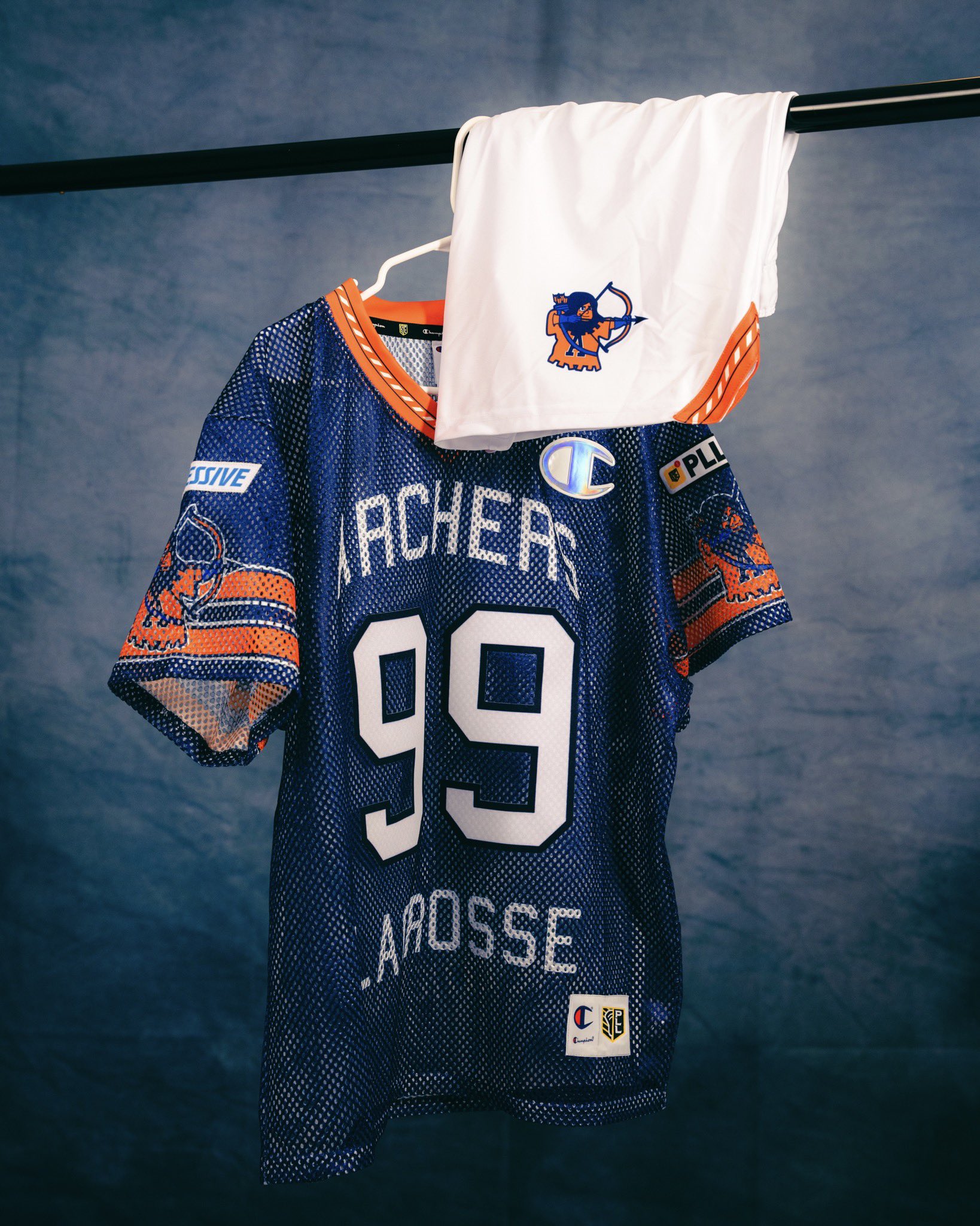
Clean and simple, just like Chaos’ new look. Blue and orange is an incredible color combo to utilize for a throwback like this. The only reason I don’t have it ranked ahead of Chaos is because I’m trying to be less biased with my Archers fandom in this post. Final verdit: shut up and take my money.
6. Atlas
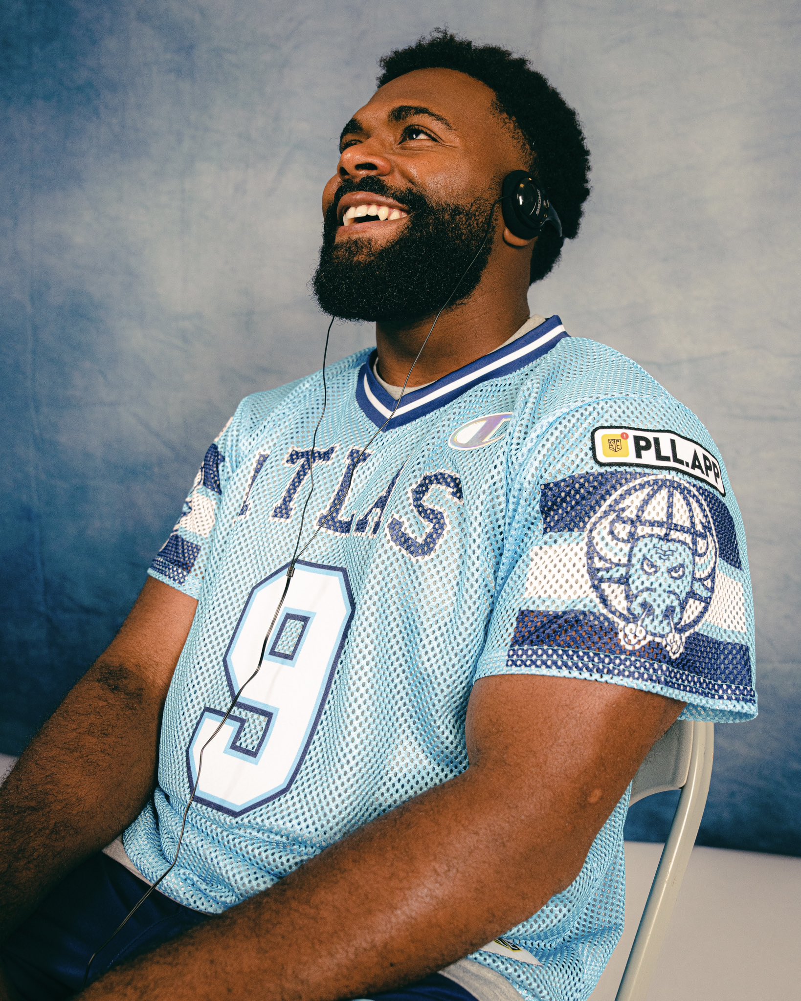
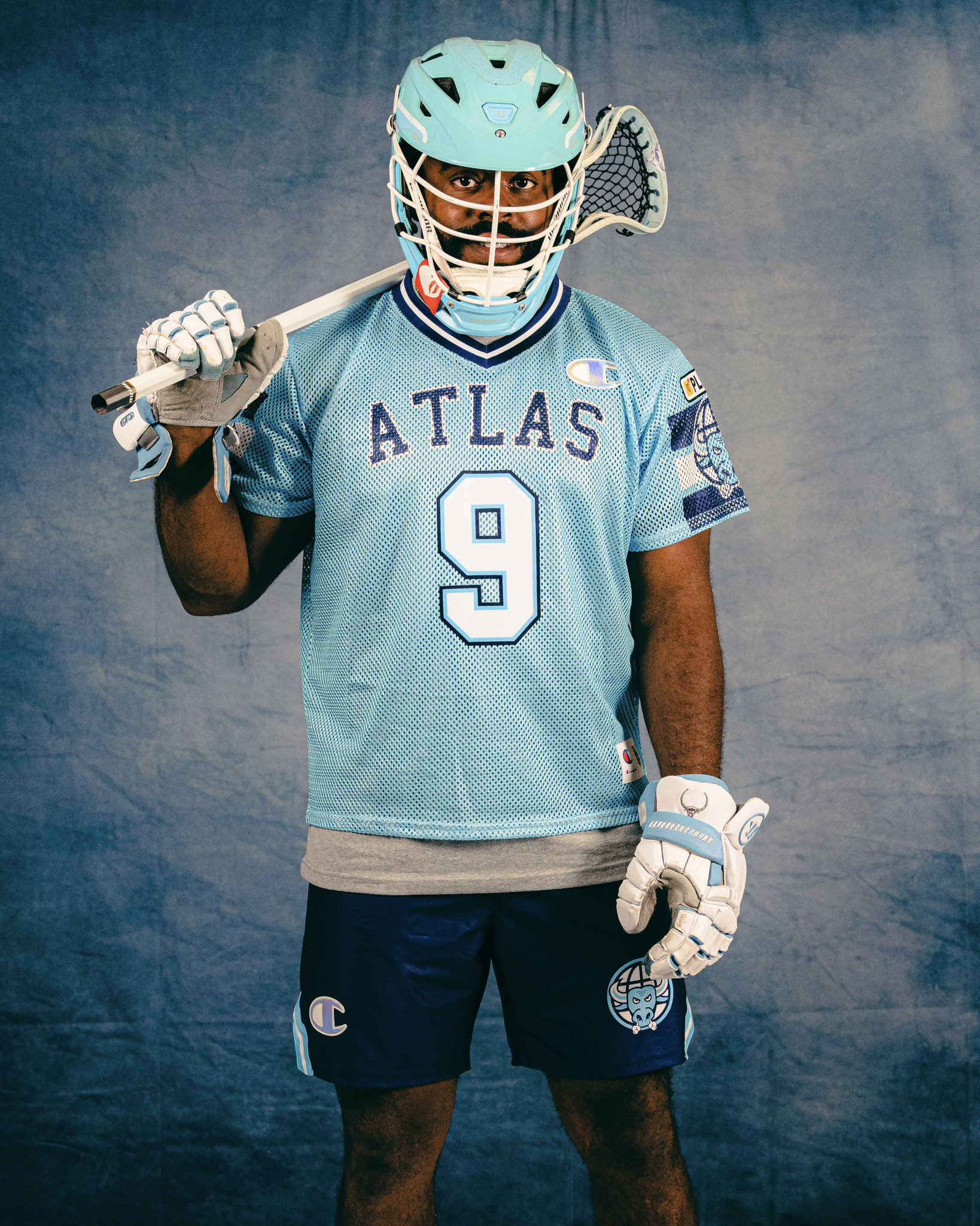
I am a certified Atlas hater until they bring the purple back into their uniform options. That said, I love the big, block, partial arm lines with the cartoon bull in front of it. I don’t have anything else to really promote or complain about with this uniform. Final verdict: bring back the purple and you bring me back on board.
7. Waterdogs
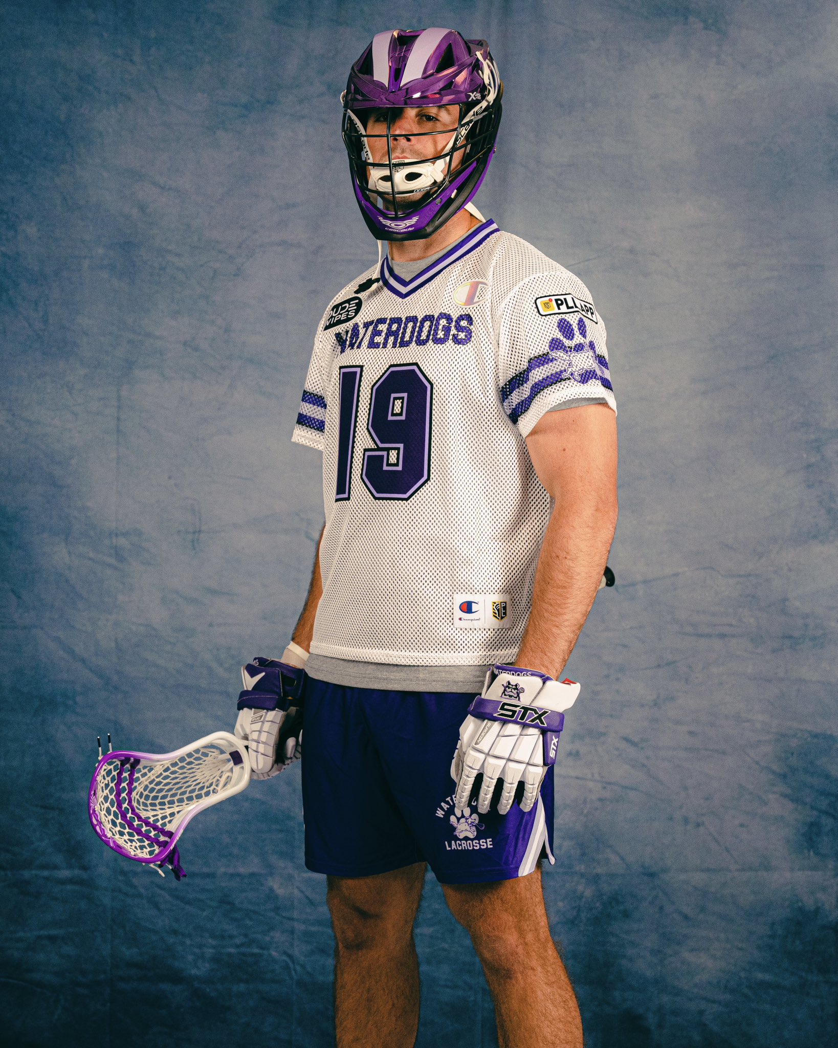
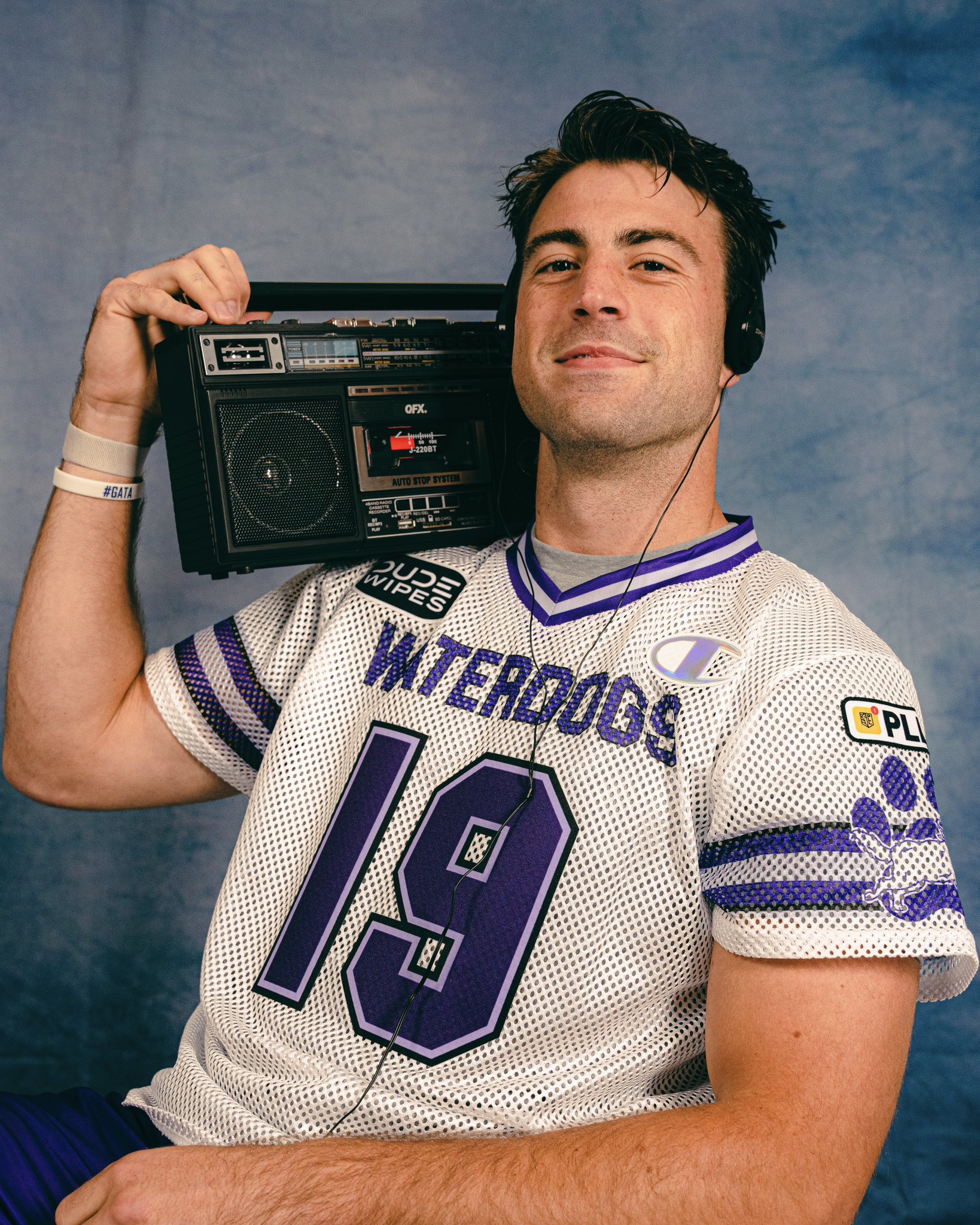
Perfect throwback font for the numbers, but what Waterdogs have been putting out a string of uniforms this year that can only be described as, “meh.” I don’t hate it, but I don’t love it. I feel like more could’ve been done with this, and I miss the team’s emphasis on two-toned purple. Verdict: Just doesn’t do it for me.
8. Redwoods
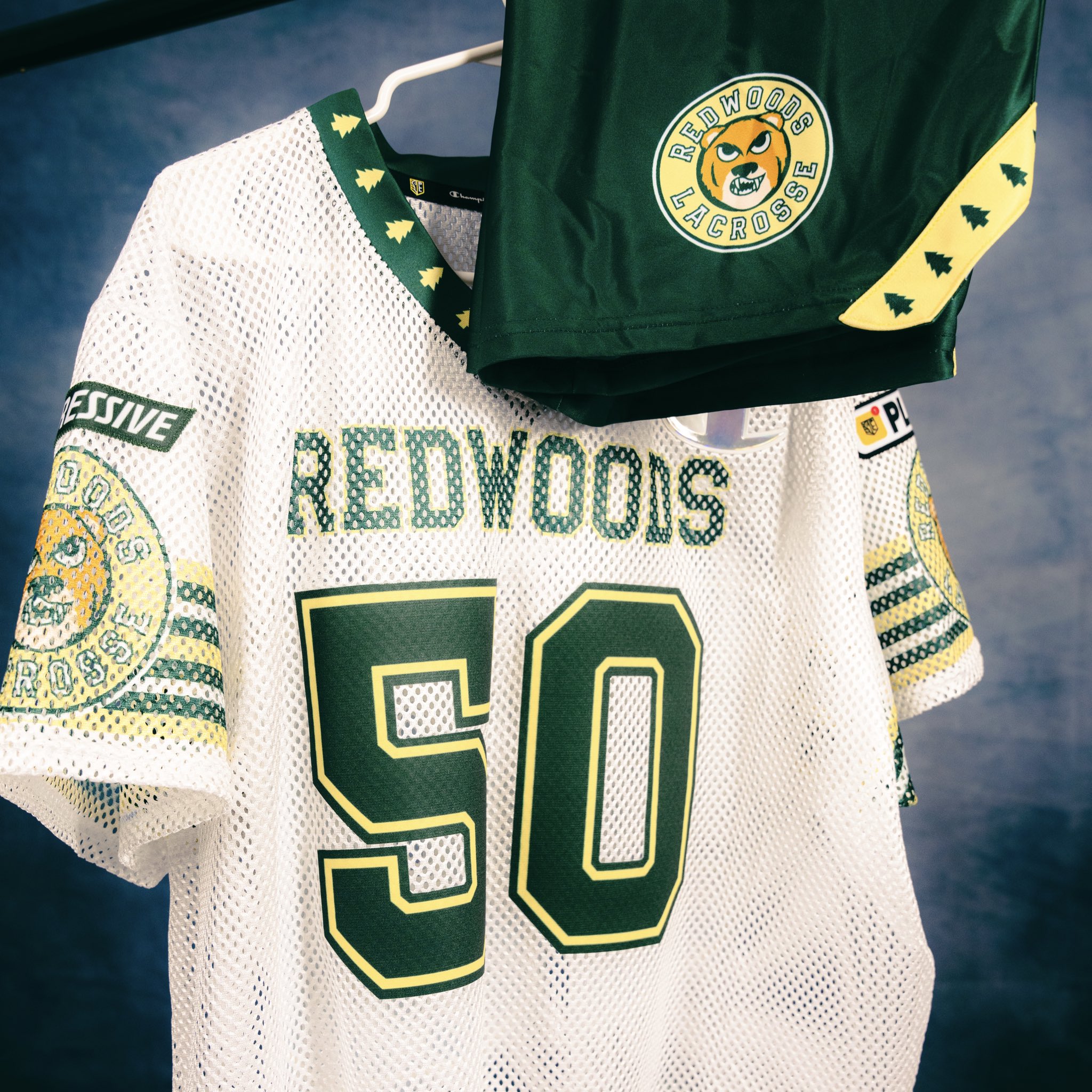
Oh how the mighty have fallen in my eyes. For how much I loved Redwoods throwbacks last year, I’m equally if not more disappointed in this year’s look. This looks like the uniform that a high school in a Netflix teen drama would use. The only saving grace for this uni is the cartoon bear; I absolutely LOVE that piece of the jersey. Green and Yellow as a color combo will never be something I can hate on, but it’s just not enough to make me feel good about how this turned out. Final verdict: *insert Jim Carrey screaming “Oh come on!” from Liar Liar here*